How to Design a Direct Mail Letter
By Jeffrey Dobkin
In direct mail, your success may be just one letter away.
Purposeful letter DESIGN can make your direct mail letter visually stunning and a more effective sales letter.
A sales letter is a self-portrait of the sender in a direct mail campaign.
A sales letter is the most effective single sheet of paper you can send in a direct marketing campaign.
In fact, the use of a great letter is the most effective you can be in direct marketing.
But is it really a letter? In truth, a letter is really a personal communication you write to one or two people. When you send it to a few hundred, a few thousand, or a few million people, it’s an advertisement. Specifically, what you see in direct mail packages is a one-page, highly stylized ad designed to look like a letter. Any arguements?
The letter is hardest-working part of the direct marketing package you mail.
People look at the brochure, but they read the letter.
A great sales letter is far more important than a brochure, and it can be effective if used just by itself.
The Specifics of Design:
Paper size: Unless you are exceptionally long-winded (like me,) most commercial direct mail sales letters should appear typed on a single side of a standard 8-1/2″ x 11″ sheet of paper, then folded copy-side out so the recipient sees the copy as soon as he or she opens the envelope. This can be a tri-fold or a bi-fold (in half).
If your sales letter requires more than one page, it’s least expensive to use the back of the sheet. Printing on the back never looks as good as two pages printed on the face only, but is always cheaper to print, which may justify this format. In smaller mailings the paper cost doesn’t matter, but when you’re mailing a few hundred thousand sheets and it doubles your paper cost, it’s expensive.
It can also be cheaper to mail: if a larger sheet of paper kicks your mailpiece over the 1 oz. mark even by just a hair, trouble: requires an additional 26 cents to mail at the 2 oz. rate, or whatever it costs for the second ounce these days.
My favorite format for a long-copy style sales letter is an 11″ x 17″ sheet folded in half. This forms the letter into an 8-1/2″ x 11″ 4-page booklet format. The two page letter is laid out with page one on the face of the booklet, and page two on the inside right hand page.
This larger format also allows for up to four pages of writing, so lots of room for additional sales copy.
If there is a third page of copy in the letter, move page two of the letter to the inside left page, and the third page of the letter moves to the high visibility inside right.
Since this large format requires a larger 9″ x 12″ envelope to mail, I prefer a second fold in the letter to form a final trim size of 8-1/2″ x 5-1/2″ to be mailed in a 9″ x6″ booklet envelope.
With any size paper, the letter should still be folded with the first side facing out with the salutation being the first copy readers see.
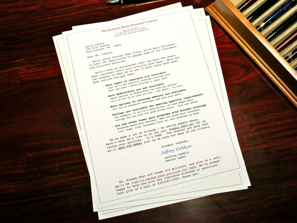
Elegant and Responsive Insurance Sales Letters written by Jeffrey Dobkin
If you find your letter is slightly too long for one page:
Technical: Let the right and left margins out 5 to 10 spaces. This will allow your typing to go a little farther out to the side edges of the paper.
Additionally, extend your letter almost to the paper’s bottom edge.
The longer line lengths and more lines per page will allow more copy to fit on a single page.
Then before printing the final copy (if printing a short run from your office,) reduce the letter print size by 5% to 10% in your printer or on a quality photocopy machine.
For longer runs, ask your printer to reduce the image file by 5% or 10% so the text blocks are nicely framed with an area of white space on the page. You can also ask your printer to “shoot it down” or reduce it in camera before it goes on press.
This reduction will give your sales letter slightly smaller type, as well as the added bonus of additional white space around the top and sides of the letter.
I sometimes reduce the image of the letter copy just to make it appear shorter, crisper and look easier to read.
Going Long:
If your direct mail package requires longer copy – like a consultive selling proposition or long-form ad-type letter, as I briefly mentioned, my first choice is to use a single oversized 11″ x 17″ sheet of paper folded in half to create an 8-1/2″ x 11″ four-page letter.
This is also the most effective format for a three-page letter. This format allows for plenty of selling copy and plenty of white space around it.
Make it look attractive and easy to read, even if it isn’t.
Above all, a direct mail sales letter must look attractive and appear to be easy to read.
The typed copy should be framed with lots of white space — which always makes it look easier to read.
Framing your copy with a broad white border gives the typography a “breathing area,” and makes it more inviting.
If your letter looks like it’s going to take a long time to read, it’s just tossed in the pile to be read sometime between later and never, and eventually winds up getting thrown out.
So Rule Number 1: Your letter must look attractive and easy to read, so more people will read it.
Typeface Selection:
Since I’m old school, I always recommend typewriter-style type to make your sales letter look like it was just typed on a typewriter (hey, remember them? No? Me neither.).
The size of the type in a letter is determined by the amount of copy you have and the amount of space it needs to fit into.
Courier is my favorite old-school typeface for letters and is used 12/12 (12 point type on 12 point leading – the space between the lines) because it looks OK in a slightly larger size.
Courier typeface can also be set 11/12, 11/11, and 10/11 if the copy is long.
Keep in mind the believability of “this just came off my typewriter” falls off fast if the type is too small, so I wouldn’t go below 9 point type. American Typewriter typestyle from ITC Corporation works OK for very commercial letters.
Make the first line short and compelling to read. Like this.
Here you can see the value of a line that stands alone.
Since a single line is short and set apart, if that’s your entire opening paragraph everyone will read it.
The first line of your sales letter is the single most important line because it must interest the reader enough to convince him or her to continue reading.
This line has only one function: Grab the reader’s attention and demand he read further.
To do this, an opening paragraph should be one line—maybe two lines at most.
Think of your first sentence like the headline of an ad. Because it is.
A single line can be most electric. A single line is too short for a reader to pass by.
Inspire your reader at his first glance to read it, make it so interesting he has to continue; then unfold the rest of your copy.
Paragraph Design:
To start the eyeflow of the reader, indent the first line of all paragraphs four or five spaces.
This also breaks up the copy from the monotony of squared-off visual blocks of text.
Set the paragraphs to rag right (this is a ragged edge of type on the right-hand side) to further break up the look of the block of copy.
Important but boring: never justify the body of the letter.
Technical Tip: To make the letter look less forbidding and faster and easier to read, make the top line of each paragraph shorter on the right-hand side than the lines in the rest of the paragraph.
This rounds the paragraph and makes the paragraph appear shorter – which encourages reading. If it creates an awkward line break or poor copy flow, forget it.
Since we are dealing with letters as both copy and art, consider each and every change: make a deliberate call on where each line ends, and every line break on the right-hand side of the letter. It’s part of the letter design. I do.
Keep paragraphs short.
Limit paragraph length to five lines. If necessary a maximum of seven lines — at the very most.
If a paragraph runs longer than you want, break it into two paragraphs.
Artificially broken paragraphs are OK—this isn’t English class, it’s real life.

View Financial Advisor Sample Letter
Stagger paragraph lengths.
This keeps the copy looking fresh and visually interesting.
One short paragraph, two long, two short, one long, etc.
Varying the text block design makes your letter look inviting. No one wants to read a wall of type where each paragraph looks exactly the same.
Type design
To keep the letter visually stimulating, and to direct the eye of the reader to the parts you wish him to see, set off important parts of the letter by underlining one or two words or a short phrase in all but one or two of the paragraphs.
Use bold in one or two paragraphs. For words in a list, bold can be used more frequently, but don’t overkill.
Italics can be used more frequently because they are less intrusive.
Use ALL CAPITALS LETTERS only once… OK, maybe twice, on a page for an important short phrase that describes a really attractive benefit.
Visual Letter Tricks:
To break up the copy and keep it visually interesting, in the center of the letter show a bulleted information list to catch and hold the reader’s attention.
Since people buy because of the benefits they receive with the product, this is a great place to show off a list of the benefits of your products or services.
Bulleted copy:
• Directs the eyeflow to this area
• Draws attention to the important parts
• Shows the strongest benefits
• Enhances your best offer
• Highlights your guarantee
• Pulls the eye directly into features you want your readers to see
• Increases the response
If your heart is set on showing the features of your product as well, list them in this brief, bulleted style.
Another visual trick in commercial direct mail letters is to use a centered, shortened paragraph:
You may also use a shortened paragraph in the center of the page to direct the reader’s eyes
to the important points; or simply to break up the letter design and keep it visually interesting.
Indent a paragraph on both sides with wide margins. You can also justify the type to set it apart
from the rest of the letter even further.
Technical: This paragraph can be in a smaller or different typeface. A paragraph like this increases
visual interest. When used with a smaller typeface, it can also increase the amount of copy
you can get on a single page without making it look crammed or forbidding to read.
Typeface Selection
If it gives a clean impression, you can just use that old Smith-Corona portable typewriter you have in your closet—I used one for years. Just kidding, I’m not really that old. Am I? An IBM Selectric isn’t a bad choice, either. What? You never heard of that, either? Well… me neither.
Nowadays most folks use a computer, but don’t get lost in all those fancy typefaces. Just make it look like a letter. Use typewriter-style type. Sorry, very few exceptions*.
*Exceptions to the typewriter-style type rule:
Courier is a monotype letterface, meaning each letter is the same width.
It’s larger in width than most other typefaces and allows less characters per line.
When you need more room for your longer copy to fit, and you’re out of room with Courier typeface, there are typefaces that are condensed and will allow more much copy writing on a page.
Newspapers typically use Times Roman, which in itself is a condensed type face.
If your sales letter copy runs really long, Times Roman will allow you to increase the copy you can comfortably fit on a page by approximately 40%.
Unless you’re careful using this typeface – or other similar typefaces – your sheet of paper can start to look more like a brochure than a sales letter, which will decrease it’s credibility – and decrease response.
I have a few typefaces that I use including Bookman, Times Roman, and Century Schoolbook. I use them when Courier would make the letter type too dense. They are all variable-width, serif style typefaces.
Begin designing your direct mail sales letter at the very top of the page:
Way before the salutation, your letter should start to sell the response. (Remember the objective: generate a phone call?)
To further the impression that your highly stylized ad is really a letter, use a letterhead with your company name and logo.
But since you can use this area more effectively for selling and the logo is not a reader benefit, make your logo smaller than usual.
Then reduce the size of your letterhead so that it too doesn’t get in the way of your sales message. Perhaps you can squish it over to the left or spread it out across the top so it doesn’t take up much vertical space – allowing room for more selling copy. Copy sells. Er… great copy sells.

View Free Sample Letter
Drop in some early sales copy on the right hand side of the page, above the salutation.
The right-hand top of page is a little-used space and usually left blank. I use it in most of my letters to highlight the main reader benefits, or the offer and start to drive response.
This copy block can be set in any style and any size type, since it’s not really viewed as part of the body of the letter.
It can almost be an ad in itself, but don’t use a border—it will take away from the intended image of the page as a letter. You have about 1/2 to 1 inch of vertical space to experiment with, and one or two lines of copy work well here.
Following this area comes the salutation on the left, then the letter body, in traditional form and format.
Date: If you need to show a date, you can use just the month and year (November, 2016).
If you’re unsure about your mailing date, most definitely leave it out.
Once printed, a stale date can sink a mailing like a stone and waste every single sheet of paper it’s printed on.
Think carefully about putting in a date. Remember how you were going to get your letter in the mail in June, and here it is August 14th.
On smaller or more personal-feeling direct mail letters, a date increases credibility and its effectiveness although just by a small and often immeasurable amount.
Increasing readership through artful letter design —
As in any piece of art, each element of your direct mail letter design enhances or detracts from the appearance, and directly affects the readership — which certainly affects response.
The more elements you consciously control, the less you leave to chance, the better the letter will work for you.
Great letter design will ensure that your direct mail letters will be consistently effective.
Awesome Network Marketing Letters
When you’re finished writing and designing, and happy with your letter’s appearance, run your eye down the right-hand side and bring down any words that stick out too far into the margin.
If your letter is commercial-looking and not too personal, a small amount of margin writing – one or two handwritten marginal words or a short phrase – can call attention to a strong benefit. Hand-underlining can also be effective, if used sparingly.
Sign with a legible signature. While your actual signature may be a squiggle, your signature in a direct mail letter is a visual hook and needs to be recognizable and legible.
Don’t forget to enhance your letter with a powerful PS.
A PS is a highly read part of most letters, and as such should contain a synopsis of your best offer; your call to action and your phone number in bold.
Shorten the right-hand margin of the PS one inch to tuck it in attractively. A handwritten PS can also work if it’s very short, but if your handwriting is less than perfect, don’t chance it.
Always keep in mind that you are not writing a letter:
You are writing advertising direct mail copy and inserting it into a piece of 8-1/2″ x 11″ advertising art.
The objective of the art is to create an attractive design that makes the copy appear interesting and easy to read.
The objective of the copy is to guide the reader through a series of benefits leading to a phone call. You accomplish this by creating a desire to inquire (pick up the phone), or call for FREE Information, call for a FREE Booklet (booklets are my favorite call-generator device) or in the case of insurance: to obtain a free quote. Your letter design should make that extra one reader in 100 pick up your letter, read it… and call.
Enjoy this article? It’s technical, and that makes you pretty much of a geek. Me too. Respect.
Read the previous article, How To Write a Great Sales Letter.
Read then next article: Do Insurance Sales Letters Really Sell Insurance?
Jeffrey Dobkin will now take your questions. 610-642-1000 rings on his desk. Or email Jeffrey at jeff at dobkin dot com.
No, seriously, he’ll be happy to answer your questions…

View Free Sample Network Marketing Letter
Hey, don’t forget to sign up for our occasional newsletter. It isn’t that frequent because when it’s nice out, Jeffrey takes his motorcycle out. When it’s cold or rainy out, Jeffrey sits around dreaming about taking his motorcycle out…
You can see our FREE SPAM policy here, or read an article “You Emailed What?”
While you’re here, visit our Bookstore, or just go ahead and buy our Awesome Insurance Sales Letter Series – over 25 insurance sales letters that are written to make people call you. For under $300 bucks you can get more calls and write more business than you ever thought possible. It’s like finishing all your marketing in a single evening.
Thanks. Questions? Comments? Your call is always welcome: 610-642-1000. Ask for Jeffrey, he’s always happy to speak with customers and friends. Well, most of the time, anyhow.