Letter Design: The Art of a Direct Mail Letter – How to Design your letter for Maximum readership and response
Letter design paints a self-portrait of the sender in a direct mail campaign.
Here’s how to design one that makes you look professional and increases response.
A letter is the most effective you can be in marketing for 56¢.
A letter is the most effective you can be in marketing at any price. In direct mail, your success may be just 56¢ away.
But is it really a letter?
In truth, a letter is really a personal communication you write to one or two people.
When you send it to a few hundred, a few thousand, or a few million people, it’s an advertisement. Specifically, what you see in most direct mail packages is a one-page, highly stylized ad designed to look like a letter.
Your letter is the hardest-working part of the package you mail. People look at the brochure in your direct mail package, but they read the letter. A well designed letter is far more important than a brochure, and it can be effective if used just by itself.
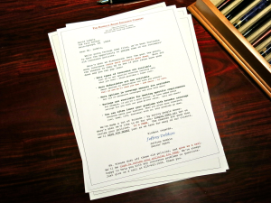
Elegant and highly responsive – sales letters written by Jeffrey Dobkin
Letter Design…
Unless you are exceptionally long-winded like me, most commercial direct mail letters should be typed on a single side of a standard 8-1/2” x 11” sheet of paper, then folded copy-side out so the recipient sees the copy as soon as he opens the envelope.
If your letter requires more than one page, it’s least expensive to use the back of the sheet. Although this never looks as good as two sheets of paper printed on the face only, its lower cost may justify this format. It should still be folded with the first side facing out.
If you find your letter is slightly too long for one page, let the right and left margins out a total of 5 to 10 spaces. This will allow your typing to go a little farther out to the side edges of the paper. Additionally, extend your letter almost to the paper’s bottom edge. The longer line lengths and more lines per page will allow more copy to fit on a single page. Before printing the final copy, reduce the letter by 5% or 10% on a quality photocopy machine or when you print it out from your computer.
You can also ask a printer to “shoot it down,” to reduce the size of the letter before printing. I generally recommend a 10% reduction or less. This will give you about 1/2″ additional clearance of white space on each side. The reduction will give your letter slightly smaller type – a one point reduction – as well as the added bonus of additional white space around the top and sides of the text. I sometimes reduce the size of a letter to 90% of original just to make it appear shorter and easier to read with the type slightly smaller and more white space framing it.
If the letter package requires even longer copy, my first choice is to use an 11” x 17” sheet folded in half to create a four-page letter format. This is also the most effective format for a three-page letter—leave the back of the second page blank. This allows for plenty of selling copy and plenty of white space around it.
Above all, the letter must look attractive. It should have lots of white space, making it look easy to read, even if it isn’t. Frame your copy with a broad white border—this “breathing area” makes it look more inviting. If your letter looks like it’s going to take a long time to read, it’s just tossed in the pile to be read sometime between later and never, and it eventually winds up getting thrown out.
So Letter Design Rule Number 1:
Your letter must look good so people will read it.
Use typewriter-style type to make your letter look like it was just typed on a typewriter. The size of the type in a letter is determined by the amount of copy you have and the amount of space it needs to fit. Courier is my favorite typeface for letters and is used 12/12 (12 point type on 12 point leading) because it looks OK in a slightly larger size. It can be used 11/12, 11/11, and 10/11 if the copy is long, but the believability of “this just came off my typewriter” falls off fast if the type used is too small. American Typewriter typestyle from ITC Corporation works OK for very commercial letters.
Make the first line short and compelling to read. Like this.
Here you can see the value of a line that stands alone. Since it’s short and set apart, everyone will read it. The first line of the letter is the single most important line because it must interest the reader enough to convince him to continue reading. Grab the reader and demand he read further. To do this, an opening paragraph should be one line—maybe two lines at most. A single line can be most electric. A single line is too short to pass up. Inspire your reader at his first glance to read the rest.
To start the eyeflow of the reader, indent the first line of all paragraphs five spaces. This also breaks up the copy from the monotony of squared-off visual blocks of text. Set the paragraphs to rag right (ragged edge of type on the right-hand side) to further break up the look of the block of copy. Never justify the body of the letter.
Letter Design, technical aspects…
To make the letter look less forbidding and faster and easier to read, make the top line of each paragraph shorter on the right-hand side than the lines in the rest of the paragraph. This makes the paragraphs appear shorter and encourages reading. If it creates a bad break, poor copy flow, or an awkward sentence ending, forget it. Since we are dealing with the design of letters as both copy and art, consider each and every change. Personally notice and make a deliberate call on where each line breaks on the right-hand side of the letter. I do.
Limit paragraph length to seven lines at most. If a paragraph runs longer than seven lines, break it into two paragraphs. Artificially broken paragraphs are OK—this isn’t English class, it’s real life.
Stagger paragraph lengths so they don’t all look the same, keeping the copy looking fresh and visually interesting. One short, two long, two long, one short, etc. Vary the text block design to make it look inviting. No one wants to read a wall of type where each paragraph looks exactly the same.
Next, to keep the letter visually stimulating, and to direct the eye of the reader to the parts you wish him or her to see, underline one or two words or a short phrase in all but one or two of the paragraphs. Use bold in one or two paragraphs. For words in a list, bold can be used more frequently. USE ALL CAPITAL LETTERS only once or twice on a page for a short phrase that describes a really attractive benefit. Italics can be used more frequently because it’s less intrusive but still, don’t overdue it or it looses its effectiveness.
Break up the letter copy and keep it visually interesting. In the center of the letter you can show a bulleted list of information to catch and hold the reader’s attention.
Bulleted lists:
• Directs the eyeflow to this area
• Draws attention to the important parts
• Shows the strongest benefits
• Enhances the best offer
• Highlights the guarantee
• Pulls the eye to features you want your readers to see
• Increases response
If your heart is set on showing the features of your product, the way to list them is in this brief, bulleted style.
Advanced Letter Design:
Another visual letter design trick in commercial direct mail letters is to use a shortened paragraph:
You may also use a shortened paragraph in the center of the page to direct
the reader’s eyes to the important points. Indent a paragraph on both sides
with wide margins, and justify the type to set it apart from the rest of the letter..
This paragraph can be in a smaller or different typeface. A paragraph like this increases visual interest. When used with a smaller typeface, it can also increase the amount of copy you can get on a single page without making it look crammed or forbidding to read.
If it gives a clean impression, you can just use that old Smith-Corona portable typewriter you have in your closet—I used one for years. An IBM Selectric isn’t a bad choice, either. Ok, ok, nowadays most folks use a computer, since millennials (like my kids) have never seen a typewriter. Don’t get lost in all those fancy typefaces. Just make it look like a letter. Use typewriter-style type. Sorry, no exceptions.
Begin your letter at the very top of the page. Way before the salutation, your letter should start to sell the response. (Remember the objective?) To further the impression that your highly stylized ad is really a letter, use a letterhead with your company logo. But since you can use this area more effectively for selling and the logo is not a reader benefit, make it smaller than usual. Then reduce your letterhead so it doesn’t get in the way. Perhaps you can squish it over to the side and drop in some early sale copy on the right.
The copy above the salutation and body of the letter can be set in any style and any size type, since it’s not really viewed as part of the body of the letter. It can almost be an ad in itself, but don’t use a border—it will take away from the intended image of the page as a letter. Following this area comes the letter itself, in traditional form and format.
Following the letterhead and its accompanying pre-selling copy, it’s best to show a date, even if it’s just the month and year (September 2018). If you’re unsure about your mailing date, leave this out. Once printed, a stale date can sink a mailing like a stone and waste every single sheet of paper it’s printed on. So think carefully about putting in a date.
As in any piece of art, each element of the letter design enhances or detracts from the appearance, and directly affects the response. The more elements you consciously control, the less you leave to chance, the better the letter will work for you in increasing response. This will also ensure that your letters will consistently be effective.
When you are finished and happy with your letter’s design and appearance, run your eye down the right-hand side and bring down any words that stick out too far into the margin. If your letter is commercial-looking and not too personal, one or two handwritten marginal words or a short phrase can call attention to a strong benefit. Hand-underlining can also be effective, if used sparingly.
Sign with a legible signature, and don’t forget to increase the response of your letter with a powerful PS. Shorten the right-hand margin of the PS one inch to tuck it in attractively. A handwritten PS can also work if it’s short, but if your handwriting is less than perfect, don’t chance it.
Always keep in mind that you are not writing a letter, you are writing copy and inserting it into a piece of art. The objective of the art is to create an attractive design that makes the copy appear easy to read. The objective of the copy is to guide the reader through a set of benefits leading to a desire to inquire: pick up the phone and call.

Jeff Dobkin Illustrated
Jeffrey Dobkin is a direct marketing specialist who writes and designs letters for a living.
Call him on it: 610-642-1000 rings on his desk.